SIGNING OFF

After reviewing the footage more objectively in post production, it was still clear the only usable footage was from the first setup. However, this became impeded by my initial intention for the camera coverage that was to be considerably cut up in post, interspersed between the four setups. As a result, I was quite limited in the editing options and ultimately chose to discard all narrative/stylistic motivations and treat the project as a technical exercise in light (and the effects of the colour grade on light) – I know, I know, ironically you’re thinking this is essentially the brief for Assignment 4!

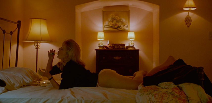
In regards to the final grade I am really happy. On the shoot I felt the cooler temperature worked but after seeing it on the big screen, the skin tone just didn’t feel right and I much prefer the balanced, slightly warmer result. The colour grade also better draws your eye to the light modelled on Sarah, most likely because it provides depth/contrast in comparison to the raw, flat S-Log footage.

The second insight that transpired in post was the results of the 1/50th shutter with 50fps footage. Any time there was movement from the subject at a normal to fast pace, the shutter setting looked more like a cheap ‘n’ nasty, slow-mo trick in post, rather than in camera. Although the shots that saw Sarah either static or slow moving produced an interesting effect, which I was pleased with in the final edit. I would really like to explore and research the effects shutter speed has on video/film, as I’ve never considered breaking the ‘rule’ of shutter=doubled frame rate.

Finally, the decision to work with the Sony A7s (a friend’s) was meant to ‘put to the test’ my technical knowledge while offer a higher quality image for colour grading. However, I had not used the A7s for sometime, which could have been relieved with a pre-shoot test/tinker but due its availability this was not an option. Even though I was amazed by the flexibility of the image in post, particularly the HDR from shooting S-Log, I really didn’t enjoy the ergonomics of the A7s. Since it is mirrorless, the body is very thin and rectangular and is so compact I felt it was uncomfortable to hold. More importantly it was really prone to lens flares and ghosting! After doing some online research this seems to be a recurring problem for the A7s, particularly in high contrast conditions like what I was shooting in. I suppose this issue could have been combated had there been time to become more familiar with the equipment.

While the final project is rather underwhelming for an end of semester piece, at least I’ve got something. I particularly like the effect of the long close up of Sarah, as the duration really asks you to study the image and becomes reflexive (at least it does for me). While this was a hard shoot to reflect on objectively, I can see that there were one too many circumstances that attributed to a snowball: my headspace, unfamiliarity with the camera, too loose of a plan (in conjunction with these other circumstances), my stubbornness to shoot in a room that couldn’t be accessed from outside, over estimation of 4 setups and the pressure (my own) to produce a quality, graduate piece. Had even one or two of these conditions been eliminated maybe it would have been more manageable. No doubt I will apply this experience to future projects and be able to better recognise these kind of circumstances.

Since I graduate this semester this is my last blog post at RMIT – and what a bittersweet post to finish on! But I’ve learnt so much in Film Light both in class, during the exercises and upon self reflection and really look forward to taking this knowledge with me into the next chapter. Thank you to Robin for being a wonderful mentor! Until next time.

GHOST

In all honesty, I’ve put off reflecting on my shoot because I am so disappointed with the results. Rather than dwell on my headspace (on the day and the weeks leading up to) that attributed to its faults, I will work to move forward and reflect on the solutions gained from hindsight.

First of all, Kerry was on fire for the entire shoot, offering lighting solutions, innovations and general support. I couldn’t have done it without him and I’m not even sure how he made sense of my gibberish communications. Also Ryan and Sarah who maintained their always calm demeanour – I feel fortunate to have worked with such a patient group.

I made the decision to change the ‘narrative’ to utilise the empty, family home and approached the day with a loose concept guided by a set of actions and emotions. The idea imagined Sarah as a metaphor for the memories that lingered in that space, like a ghost fuelled by emotion. Therefore each of the four lighting setups would still be according to plan, but Sarah’s actions would express an emotion. However this ‘loose’ approach backfired when the motivation for action didn’t work and because I wasn’t thinking like my usual self, I hit a wall. From this point forward a landslide was taking place in my head, which became evident after the first set up.

The first ‘scene’ was the closest to my plan, executing cool, soft, diffused light and illustrating longing. We maintained a moody feel through exposure control both in camera and practically, which included a bounced Dedo camera right in the wide and a core board to both bounce a Dedo and cut sunlight in the close ups.

The scenes that followed were ultimately tripped by my flawed ideas for action. When I reviewed the footage 24 hours later with fresh eyes, the missed opportunities and simple solutions were abundantly clear. The most obvious – there was an entire house at my disposal! Why didn’t I maximise on this and break out of the bedroom, since the revised concept didn’t need to be limited to that space. I guess the below set up was my improvised attempt but that mental landslide had gone too far. My idea for the action could have been resolved with Sarah pacing in the living room lit by the venetian blinds; close ups of her feet or close up shots opening/closing the blinds.

The second realisation was ‘quality over quantity’ – instead of 4 shots I should have focused on just two. Although this seems glaringly obvious in hindsight, I have enough experience that should have seen me rectify this on set. I should have maintained the first cool, soft scene and then contrast it with a warm, hard scene. If I had the opportunity to shoot again, I would strip away the action and instead mirror everything in the second setup, since this would cut nicely together and accentuate the contrast in light.

The decision to shoot 50p resulted in my greatest mistake, I forgot to match the shutter with 1/100th or 1/120th. Sure, this mistake is not the end of the world but in my final weeks of nearly 4 years of film studies, I am beyond disappointed. Initially shooting 50p was to ensure the handheld camera looked smoother when played back at 25fps and for the overall style to feel more graceful. I won’t fully know its effects till post, but hope the expected motion blur might be passable as an artistic choice and not the complete blunder it really was. Also, fingers crossed it compliments the ghostly nature of Sarah’s character.

Ironically, I felt like a ghost ‘fuelled by emotion’ and have not previously gone into a project feeling so distant from myself. I think it is all circumstantial and actually exacerbated by the emotions tied to finishing my degree this semester. But the result frustratingly affected my capacity to maintain clarity and be solutions oriented… Anyway, time to move on and edit.

RECCE

Our recce visit to Ryan’s property helped with refining my idea and to start picturing how each set up will be constructed. I plan to shoot in a bedroom with a window that faces South West, which will allow for a little sunlight late in the day. Although the home is ground level the backyard is graded, which the bedroom faces. This may become a challenge as an artificial light set up outdoors probably won’t be high enough for the window. In addition, the recce revealed the following observations:

  • Overall the natural light available is quite low
  • Latte coloured walls
  • Polished, wooden floorboards
  • Empty space that will reverberate
  • 2 GPOs available in the bedroom
  • End of April schedule, so likely overcast exterior and possible rain
  • Sun set approx. 5:50pm

Since the recce I feel my initial idea needs to be developed. The space is a recently sold family home and empty, dusty and silent. So it makes more sense to exploit this natural setting, rather than trying to fill it back up with life. On another note, I don’t have access to a car at the moment so (gratefully) need to rely on Kerry and Ryan to transport the equipment.

Looking back at these photos, I took them in mind for my “bedroom” concept but regret not taking photos of the entire space and surrounding rooms.

ILLUMINATING THE CANDLE

Barry Lyndon, Kubrick 1975

“It’s the flame of a single candle which will illuminate the darkest of souls.”
― Anthony T. Hincks

A candle uses a process called combustion, which is the burning of a substance in the presence of oxygen to produce heat and therefore, light. It is a small light source that produces a warm, flickering flame, which softly spills in an arc. We might describe candle light simultaneously as bright and or dim, due to its bright centre flame but low-volume output. When used as a single light source, the combination of its warm glow and surrounding shadows render muddy, muted tones. The miraculous effect and science behind such a simple tool is fascinating and one we surely take for granted.

The epiphany (yes, it really was for me) in the realisation the unit to measure the intensity of illumination is foot-candles, has encouraged reflection on the quality of candle light itself and its relationship to cinema. In the filmmaking industry, foot-candles remain the most common unit of measure to calculate light levels (interestingly, it prevails even in the transition to digital cinema practises). In short, a foot-candle is defined as the illuminance cast on a surface by a one-candela source one foot away. It is curious to me why this measurement is founded in ‘candles’. After a quick google search and even a tangent in etymology, there was no simple answer. However, it did point to the long term application of candles as artificial light sources, meant they became part of the language of light: ‘foot-candle, candlepower — even lux is short for candela steradian per square meter’(Schubin, 2012 [also below image source]).

Likewise, it illuminated a possible connection to Classical painters and the lighting conditions they were limited to; natural light, candlelight or oil-lamps. In particular, Rembrandt, whose discernible style is somewhat due to his principle decision to model subjects with candlelight. Through this practise, he developed an understanding of light’s relationship to depth, which could render a three dimensional object onto a two dimensional canvas. As a result of this rigorous study, Rembrandt discovered the synthesis of 3 light sources that he developed into a model; a key, fill and back light. As Walsh analyses (2015) on Videomaker.com, these three sources of illumination establish the overall intensity, shape and colour of the subject being lit.

The key light creates shape and overall brightness. The fill light controls the amount of contrast and the level of detail in the shadows, created by the key light. A background or edge light is then employed to provide separation of the subject’s profile from details in the environment or set.

Rembrandt’s practises and understanding of light/depth is no different to that of cinema – since the apparatus photographs a 3D reality into a 2D artifact. We must therefore understand how to manipulate light to suggest depth and, much to Rembrandt’s credit, employ ‘3-point’ lighting. I imagine many of us, as 21st century filmmakers, take this innovation from the 17th century for granted because we have everything at our disposal to accurately, perfectly, easily light our subjects. And we are all too happy to dismiss the 3-point model as rudimentary and as a consequence, forget its effectiveness…

Finally, my thoughts linger on not just the quality of candle light depicted on screen but the values or beliefs we associate with it. The mere candle is able to transcend its physical form to represent, both in reality and cinema, peace, fear, hope, death, religion, the occult, etc. Of course the occasions or settings we associate with candles influence these meanings but its ability to manifest into metaphor is fascinating. For instance, Tarkovsky’s Nostalghia is through its form, a metaphor for the candle. This is breathtakingly illustrated by Kevin Lee (Fandor, 2014) in his visual analysis of the film’s 123 shots, arranging them in a single image that flickers like a candle as it is slowly extinguished.

230. Andrei Tarkovsky’s Cinematic Candles from Kevin B. Lee on Vimeo.

Within the first forty seconds, half of the shots are over; that’s a far longer average than in most movies, but in Tarkovsky’s world it feels like a mass slaughter of images. By the one-minute mark, a third of all shots remain; by two minutes, we are down to seventeen. Remarkably, about half of those shots make it to the three-minute mark.

Like many light sources, we understand the quality, volume and shape of candle light but rarely question its influence on the big screen. It appears the dim candle has in fact, radiantly contributed to practices and knowledge in cinema, we often take for granted.

References

Schubin, M 2012, ‘The Light Fantastic’, Welcome to the Schubin Cafe, accessed 25 May 2018 <http://www.schubincafe.com/tag/foot-candle/>

Walsh, M 2015, ‘A Study of Rembrandt Style Lighting from the Three Point Perspective’, Videomaker, accessed 25 May 2018
<https://www.videomaker.com/article/f03/18351-a-study-of-rembrandt-style-lighting-from-the-three-point-perspective>

THE DEATH OF FILM

Since the demonstration and explanation in class of the light meter, my thoughts on its function and purpose in the digital age has persisted and in fact, sparked an entirely other trajectory of thought.

Through the analysis of Miyagawa and his intimidating body of work, as well as the countless pioneers of cinema explored in Film Light and Histories (Epstein, Godard, Zsigmond, Antonioni, Kurosawa, Fellini, Sirk, Lynch – do I continue with such an exhaustive list?), my own attitude towards the digital vs. celluloid debate has shifted. Prior to this semester I felt the inevitable transition to digital made sense and therefore was wise of the industry to adopt digital across its many avenues – because, if the technology has advanced, why shouldn’t we embrace it? And yet here I am, finding an increasingly profound appreciation for celluloid and just as importantly, the practitioners that mastered it.

The continued practise of celluloid as a ‘tradition’ is no longer an adequate argument, however, the exposure latitude and colour spectrum possible in film stocks, in many cases, is not yet obsolete. But the switch to digital may already be irreversible, considering the transition within the industry is not simply the medium but the entire framework i.e. production equipment, exhibition/projection, distribution. What then remains the benefits of shooting on film? Is purely aesthetic enough?

A collective love and or nostalgia for celluloid remains, both for professional and amateur filmmakers. Recently in 2015, Tarantino released The Hateful Eight on 70mm print, a format only 6 cinemas in Australia could authentically project (Johnson, 2016). His decision to shoot on 70mm (that is 65mm and not blown up 35mm) was to disrupt the consumption of digital media, particularly the kind in home theatres, laptops, iPads, and therefore remind us this (70mm film) was an experience specific to cinema. He claimed,

“You’ll see 24 frames per second play out, all these wonderfully painted pictures create the illusion of movement. I’m hoping it’s going to stop the momentum of the digital stuff, and that people will hopefully go, ‘Man, that is going to the movies, and that is worth saving, and we need to see more of that.’” (n.a., FilmInk, 2015).

But this affinity for celluloid is losing momentum with financiers and distributors, since in contrast to digital, film remains an expensive artistic choice. So, as the veterans of the celluloid generation retire/die (yikes)/or welcome digital, will we just have to let go of our sentiments for the medium? I can’t help but wonder [hope] if someday celluloid might experience a resurgence, like that of Polaroid, which announced its production had ceased In 2008 only to be later revived by an enthusiast of the instant film.

On December 30, 1999 Cheshire Godfrey published an article The Death of Film, The Decay of Cinema that astutely forecast the current state of the industry and its implications. Taking into account a hundred years of cinema theory critique, he ultimately raised the question of digital cinema’s validity.

The critic Andre Bazin believed that photography and its stepchild film brought people into a fundamentally new relationship with reality and the natural world. That’s because photographs, unlike every previous means of visual representation, are not subjective interpretations of visible reality but objective impressions of it. Directly caused by light leaving the things they record, they have an essential equivalence and connection to the objects they portray. […] More obviously, photography introduces an ethical dimension to our view of the world, insisting on the irreducible integrity of people and things beyond ourselves, and reminding us constantly of our relationship to them. […] Thanks to their own physicality as well their relation to the things they represent, photographs, including those in motion, are not just idle records. They are objects of contemplation whose fascination comes from the way they connect us to the world.

He concludes with a future when film is finally outmoded and proposes what will be left may look the same (for a while) but will no longer function the same (which we will eventually realise). I especially fear when Cheshire imagines ‘cinema’ will be a ‘peculiar kind of of storytelling technological art’ only found in museums to document the 20th century. As a result of this seminal article, a critical discourse perpetuated on what ‘cinema’ is if it doesn’t include film. The implications of these ideas gives me the ‘heebie jeebies’, as I don’t like imagining cinema’s future without film.

So, here I/we are, reluctantly required to re-’embrace’ the imminent future of digital cinema, even though I can’t shake the uncertainty of its ramifications. But I wonder, is this just the predicament of a film student in 2018? Will this debate be relevant to a cohort ten years from now?

References

Cheshire, G 1999, ‘The Death of Film/The Decay of Cinema’, New York Press

Johnson, N 2016, ‘Two Australian cinemas show Quentin Tarantino’s latest movie The Hateful Eight in 70mm film’, News Corp Australia Network, accessed 22 May 2018, <http://www.news.com.au/entertainment/movies/two-australian-cinemas-show-quentin-tarantinos-latest-movie-the-hateful-eight-in-70mm-film/news-story/447c435b0cc978dc690dff11002acd02>

n.a. 2015, ‘The Hateful Eight To Premiere In Australia In 70 MM’, FilmInk, accessed 22 May 2018, <https://www.filmink.com.au/lsquothe-hateful-eightrsquo-to-premiere-in-australia-in-70-mm/>

AN EXPENSIVE VISIT

On 7 May 2018 we were fortunate to have guest speaker, Rory, who generously shared a sample of his lighting inventory and industry experience. Rory provided a snapshot of the evolution of cinema’s lighting, sharing insights into the working conditions of arc lights to the flick-of-a-button LEDs.

It became apparent LEDs are the way of the future, making tungsten equipment obsolete. Although, as Rory frankly admitted, the transition is expensive, particularly in the acquisition of products from reputable brands like ARRI (who have clearly monopolised the market). However after Rory assessed each piece of equipment, the benefits of LEDs were irrefutable and thus validated its growing popularity. Some of these benefits, especially from reputable brands include:

  • Run both AC and or battery power therefore lower consumption
  • Very low wattage, affording multiple units on the one circuit
  • Shifts colour temperature seamlessly
  • Dimming control (without affecting kelvin spectrum)
  • Lifespan comparative to tungsten
  • Little to no heat output

Ironically, one of my favourite light qualities he demonstrated was the tungsten ‘650W Mini Softlite’, there was just something about the soft spread from a neat unit that really appealed to me. Side note: Curiously looked on eBay for Mole-Richardson ‘Inkies’, they’ve sold for $80-$350 AUD. Although, surely all of his gear was eclipsed by the ARRI SkyPanel, a piece of equipment even Rory seemed dazzled by Rory’s ARRI Skypanel 120. I’d love to see this in action on a film set, its flexibility, versatility and economy was jaw dropping.

Throughout the presentation, Rory did not shy from the environmental impacts various lighting equipment perpetuates. This was news to me and a subject that doesn’t make headlines on most cinematography/photography discussions. I just wish we had more time with Rory! To be honest, I think 90% if not all of the class could have happily sat there all day. I would have loved more time to hear additional ‘behind the scene’ analysis, as this sort of breakdown was so valuable.

Rory’s visit reminded me of insights gained in an interview conducted for Media 6 last semester with Tommi Hacker. Tommi is a gaffer/best boy, who has been working in Melbourne for over a decade with a number of productions to his name (just in 2017 this included Glitch, Picnic at Hanging Rock, Dr Blake and Utopia). Interestingly Tommi is one of the few gaffers who operate without his own a truck or gear. I remember he dwelled on this decision and while Tommi had no regrets, admitted he was at a stage in his career where it was possibly impairing future growth. I have spent the last 18 months imagining what a future in the industry might look like for me and one of my key avenues is the lighting department. But reflecting on Tommi’s experiences and also Rory’s accumulative $100,000+ (and growing) inventory, I feel a little bit at a loss.

Overall it was exciting to get a glimpse into the variety and breadth of lighting equipment employed in the industry. To be honest, I was bouncing like a kid in my seat while he revealed the gear. We are indebted to Rory (and Robin for the invitation) to share his wisdom and inventory and more importantly, further spark our interest in lighting.

SIMONE & ERIC

It was so much fun shooting the ‘Simone & Eric’ group exercise! To avoid confusion from “too many cooks” we divided the camera and lighting into two teams, which was effective and allowed each team to remain focused on decisions relevant to them whilst collaborating overall with the group. The choice to establish a moody, thriller theme somewhat developed organically from the group i.e. Andrew chose to interpret Eric as menacing, the camera team built tension through a long take, etc. Although, we may have got carried away with our creative interpretation of the scene.

Kerry and I were on lighting and after assessing the space we agreed our motivation would be simulated downlights. The house lights were not an option as they were too powerful with an uncontrollable spread. Since the scene was set in the evening, our next approach was to locate the actors against the black corner of the room to distance them from the window. Additionally, three of us risked our lives (and probably compromised RMIT’s OH&S liabilities) to fix the black blockout curtain that was broken and on the floor, but it was worth it as we gained substantial control!

We next focused on Lydia’s key, which was a diffused Dedo with the barn doors boxed to minimise spill on the table. The angle and height was just right to offer a shape under her left eye on the fill side. We also placed a diffused Dedo high and behind Lydia for a hair light, which works nicely to cut her out of the shadows and I think we got the intensity just right. Our last decision was to display an orange image on the laptop screen to provide a warm fill, this was subtle but effective. Kerry observed the scene, at this stage, felt too stylised so we set up a Keno Flow (4 bars, full CTO, no diffusion, 100% intensity) and bounced it off the polished, white ceiling. Initially it wasn’t effective as we placed it too far from the subjects (several meters) but after bringing it closer (approx. 3m) and raised it closer to the ceiling, we could really see the atmosphere it provided and the lift in the shadows.

The camera team asked if Andrew could have a rim light whilst in the hallway but we decided it wouldn’t be safe in a public thoroughfare. Though the effect was still achieved because the moody, low light in the room meant Andrew popped out against the brightly lit hallway. Andrew’s key light was a third Dedo diffused with Rosco Tough Silk to help direct the light and minimise spill. When viewing the footage back in post production I have mixed responses to the results, for me it is borderline too hard and warm, yet still acceptable in the space and mood.

The weakness of the set up was the reflected artificial light sources on the door’s glass/shiny surface, visible when it opens and closes. This was partially inescapable in the one-take coverage and how we blocked the scene. Overall we were really happy with the final ​product and we all bounced around ideas off one another cohesively. The camera team blitzed it with their decision to shoot the scene in a long take, as this really added to the scene’s menacing mood. Also, I felt our results on Lydia were the most effective at attaining ‘natural’ and motivated lighting.

KAZUO MIYAGAWA

Yojimbo

Going into this study, I chose to reflect on a cinematographer’s body of work I’ve not yet appreciated and am thankful for this approach, as it lead me to a master of cinematography – Kazuo Miyagawa (b. 1908 d. 1999).

Miyagawa was considered the most influential cinematographer of post-war Japanese cinema. He shot over 130 films in his career and worked closely with Akira Kurosawa, Kenji Mizoguchi, Yasujirô Ozu and Kon Ichikawa. However, it was Miyagawa’s versatility that became his greatest strength and most notable definition in style and aesthetic.

Influences

Miyagawa drew inspiration for his lighting from a number of sources. He particularly admired the ‘gloomy contrast’ between light and shadow achieved by German expressionist filmmakers and admitted this influenced the contrasty style of light in his jidaigeki films.

In addition, he drew upon his childhood memories of the aesthetic of spaces and landscapes in Kyoto, which he felt ‘trained’ his eye to ‘see’ shadows and light. This contributed to his low-key aesthetic and asymmetrically balanced compositions. Watanabe Yutaka, a Japanese cinematographer and critic, agreed this influence was identifiable in Miyagawa’s style and described a typical home in Kyoto as ‘The ​house ​is ​a ​little ​dark ​inside, ​only ​with​ a ​few​ lights ​from​ somewhere. ​The ​backyard ​and ​the ​fish​bowl​ on ​the ​terrace​ are​ the​ only ​bright ​spots ​in ​the ​space’ (Miyao, 2014).

Another key influence was Miyagawa’s studies in sumi-e (traditional Japanese paintings in monochrome ink) that provided great insight into the infinite tonalities of grey. This skill provided a unique vantage for him working with B&W film and as a result, contributed to his distinguishable ability to create a sense of ‘colour’. Sumi-e also influenced Miyagawa’s composition – a style that was rarely symmetrical yet perfectly balanced. As Dusing (1981) describes, ‘the sumi-e painter does not fill the entire surface of the paper, nor does he arrange his composition symmetrically. Instead, he uses the borders of his surface to create separate planes within the space.’

Versatile Style

Miyagawa’s versatility is most evident in the comparison of his work in films from Kurosawa, Mizoguchi and Ozu. In Ukikusa or Floating Weeds (1959, Ozu), Miyagawa helped to define Ozu’s ‘tatami-level’ low angles and distinguishable deep focus. These qualities see the cinematography as unobtrusive and ensures the natural narrative and setting are emphasised.

Floating Weeds

In Ugetsu Monogatari (1953, Mizoguchi), his style is linked to the tonal greys between the monochrome and also his long, choreographed takes. In order to satisfy Mizoguchi’s directorial desire to suspend tense moments, Miyagawa exercised long, drawn out takes that allowed Mizoguchi to achieve dramatic performances without interruption.

While in Kurosawa’s Yojimbo (1961) and Rashomon (1950), complex camera mobility and high contrast became Miyagawa’s notable technique. In his emphasis on contrast and clarity, Miyagawa stated that his was for the purpose of capturing the ‘seriousness’ of the story and that it would ‘express the true nature of human beings’.

It is clear Miyagawa constantly reworked his own techniques in order to best articulate the director’s intentions and developed significant diversity. He also continued to explore new technologies such as anamorphic formats (e.g. CinemaScope), color film stocks and development processes.

Camera Coverage

Miyagawa’s approach to camera coverage is particularly fascinating as he allows the action/movement in the scene (i.e. a samurai unsheathing his sword or river brushes swaying in the wind) to determine his camera placement. For example, the scene below from Ugestu Monogatari highlights an atypical camera position that is driven by the action. Miyagawa effectively creates a cinematic tension through his low, static, distant placement of the camera that restricts our view and forces us to patiently wait for the boat to emerge and travel to the front of the frame. This approach is observable in all his work and often is used to gradually reveal information to the viewer.

Interestingly, Miyagawa felt the camera should be thought of as part of our body, that the cameraman should become one with the camera and ‘dance with it to capture the subject’. He referred to the camera as a tool to ‘paint on film’ and mobility should be motivated by our own physical sense – I feel this explanation helps to best explain the motivation in his camera placement.

Innovations

Throughout Miyagawa’s career he experimented with cinematographic practices that lead to innovations still employed today. One of his notable innovations was the employment of mirrors on the filming of Rashomon. In a scene shot on location in a forest, Miyagawa utilised mirrors to redirect sunlight onto subjects otherwise hidden in shadow. This conserved on the costs and practicality of electric lights and allowed him to maximise on the location. His idea to use mirrors was further developed when he ‘cut’ the hard sunlight with branches and leaves to design a dappled light.


Rashomon

The second and most notable innovation of Miyagawa, was his invention of the Gin-nokoshi or ‘silver tone / bleach bypass’, a technique used in the development process. This innovation was a chemical process that created a greenish-gray tone and more importantly, provided greater control over colour saturation and tonality. The Gin-nokoshi technique has become a regular development tool for the practitioners of today, including Janusz Kamiński, Vittorio Storaro, Darius Khondji and Roger Deakins.

Miyagawa is a master not only because of his complex tracking shots, dynamic range, asymmetrical composition or deep focus, but due to his capacity to mold and adapt his own style to best suit the various collaborations across his career. To conclude in Miyagaway’s own words:

“Forget the expensive equipment. Only a beautiful person can take beautiful pictures”.


References

Allen, T 1981, ‘Journals: Tom Allen from New York’, Film Comment, July/August, <https://www.filmcomment.com/article/journals-tom-allen-from-new-york/>

Dusing, L 1981, ‘Kazuo Miyagawa honored by A.S.C.’, American Cinematographer, #5

Miyagawa, K 1985, “Paint” on Film, “Poetry” through Tone, “Rhythm (Music)”, Camerawork <https://www.filmcomment.com/blog/art-craft-cinematographer-kazuo-miyagawa/>

Miyao, D 2014, The Aesthetics of Shadow : Lighting and Japanese Cinema, Duke University Press, Durham

Tessier, M 1979, ‘Japanese Cameraman: Kazuo Miyagawa’, Monthly Film Bulletin, 48, 3, Arts Premium Collection pg. 188

BEDROOM LIGHT

The following is a brief outline of our group’s concept and how my idea aligns with our overall intention. After much consideration we came to the conclusion that each of us would be responsible for a project/shot (in total 4), but our idea must meet two common measures:

  1. We will all shoot at the same location, thus maintaining the same conditions including opportunities/limitations with light.
  2. We will all include a window in our compositions, to provide an iterative motif that is highly motivated by light.

The ideas circulating in our group include the exploration of deep focus, natural light and light that can elicit a mood. My plan is to shoot a bedroom that illustrates time passing, which will be achieved through temperature and quality changes in light. The type of light I hope to design includes:

  • Morning sunlight – hard, high contrast
  • Winter’s day – soft, overcast, cool
  • Bedside lamp at night – muddy, extra warm
  • Afternoon sun – direct, warm
  • Moonlit night – cool, soft, dim

In addition, I plan to shoot a subject within the scene to further suggest time passing through their actions i.e. reading a book, sleeping, drinking a cup of tea. My camera coverage will be driven by a loose narrative and operate hand-held. Note, it will not be a static time lapse style shoot. The below outlines key equipment requirements (at this stage). However I can refine this list if need be.

  • Canon 5D M3
  • 50mm
  • Fluid head tripod
  • 2x 1000k Fresnel w/ stands
  • 1x Dedo kit
  • 1x Kenoflow w/ stand
  • 1x C-stand
  • 1x Black core board, 1x White core board
  • 6x shot bags
  • Diffusion, CTO and CTB
  • Lee gel kit
  • Audio kit

So far we plan to shoot in Weeks 10 & 11, therefore allowing time for post production in Week 12 (and or contingency plan if need be). Next week we plan to recce the location and confirm a schedule. I will also develop a shot list and shooting schedule since my idea involves multiple lighting set-ups. In the meantime, I have sourced a few references to further demonstrate my idea.


Image sources include Lost in Translation, Lost Highway, God Save the Girl, Never Be Like You (Music Video), Atlanta, Fire Walk With Me, Real Destination

EXPECTATIONS

In Nicholas Roeg’s memoir The World Is Ever Changing, he observes the effects of our acceptance of an on-screen ‘reality’ whilst the film industry transitioned from B&W to colour film. Most importantly, Roeg highlights that our colour perception of the world establishes an expectation of how the on screen world should look. I would also surmise in contemporary audiences these imposed parameters are influenced by the context of the film, e.g. the sci-fi genre.

Interestingly, our perception and cultural acceptance of what is ‘natural’ on film continues to change and can influence performance, lighting, dialogue and special effects. Consider the groundbreaking CGI employed in the blockbuster Jurassic Park (1993, Steven Spielberg). At the time it was unbelievably ‘real’ but today would be considered artificial due to technology advancements and what we accept as natural.

Roeg observes that since our perception of reality is not in B&W, we accept its artificiality. As a result, we are less critical of B&W’s representation of the world on screen and he claims this enables it to be ‘more ‘artistic’ instead of ‘artificial’’. In fact, this (at the time) permitted filmmakers to do ‘extraordinary things’ such as stylistic or dramatic lighting that would otherwise not be possible in colour.

Furthermore, these artistic possibilities are somewhat limited to B&W as when executed in colour, render as artificial (due to our supposed expectations). But Roeg was excited by the opportunities colour welcomed and ponders, ‘How can we make colour more dramatic, what shall we do?’. This excitement is effectively illustrated in his film Don’t Look Now (1973), where primary colours are consistently contrast in the mise-en-scene to establish theme.

However, Roeg does acknowledge the unique challenges that come with colour or B&W:

Colour has its own balance, but to bring beauty to it or drama or threat is more difficult, in many ways, than with black and white; on the other hand, is more difficult to approach in terms of the actual photography than colour.

Overall, Roeg observes that our interpretation of B&W on screen is ultimately uninhibited as we do not perceive the world in monochrome. While the representation of reality on screen in colour is influenced by our expectations of how reality actually appears. So is it these expectations that attribute to the industry’s current lighting standards/style?

My understanding of the relationship between light and B&W/colour continues to develop and leads me to again consider the question proposed earlier in the semester – Why do some of the shots ‘work’ in B&W but lose a/some quality when in colour? After studying secondary sources on the internet I find this question to be a can of worms, one that opens many doors. Despite this, I was able to gain further insight from an article by Rick Hubert (Luminosity-Landscape, 2017) that discusses his take on the differences between B&W and colour photography:

Black and White conveys Depth through luminance. Luminance is extremely important to how we see and perceive photography. Luminance is a subjective measure and is determined by how bright the average person judges a light to be. Black and White or Tonal Values are essentially pure luminance. The reason luminance is so important to photographers is that our perception of depth and sense of volumetric space is affected by luminance alone and is insensitive to color. While color alone can be quite compelling, color alone does not convey a sense of depth. As such, Black and White images become a powerful tool in portraying 3-Dimensional Volumetric Space on a 2-Dimensional Canvas or Screen.

To conclude, our interpretation of B&W and colour undoubtedly differs and importantly influences our reading of luminosity. Because of this, filmmakers have unique opportunities to exploit that can ultimately influence our understanding of a scene. For now, this reflection helps to answer some of my questions but not surprisingly raises new ones… I would love to do an exercise that specifically explores the relationship between light in B&W/colour!

References
Hubert, R (2017), ‘Black and White vs. Color’, Luminous Landscape, blog post, 17 July 2017, accessed 3 April 2018 <https://luminous-landscape.com/black-white-vs-color/>

Roeg, N. (2013), The World Is Ever Changing, London: Faber and Faber